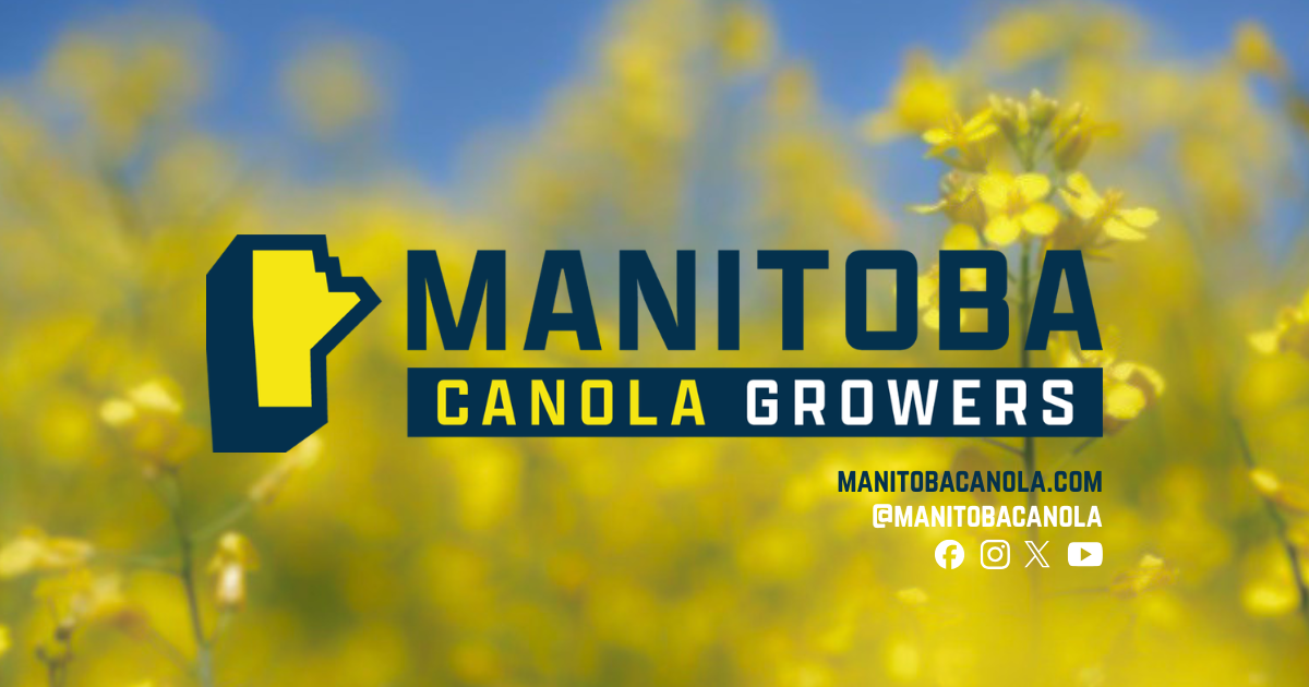
On the farm, you don’t change something just for the sake of change. You change it when it better reflects who you are, where you’re headed, and the people you represent. That’s exactly what inspired the Manitoba Canola Growers rebrand.
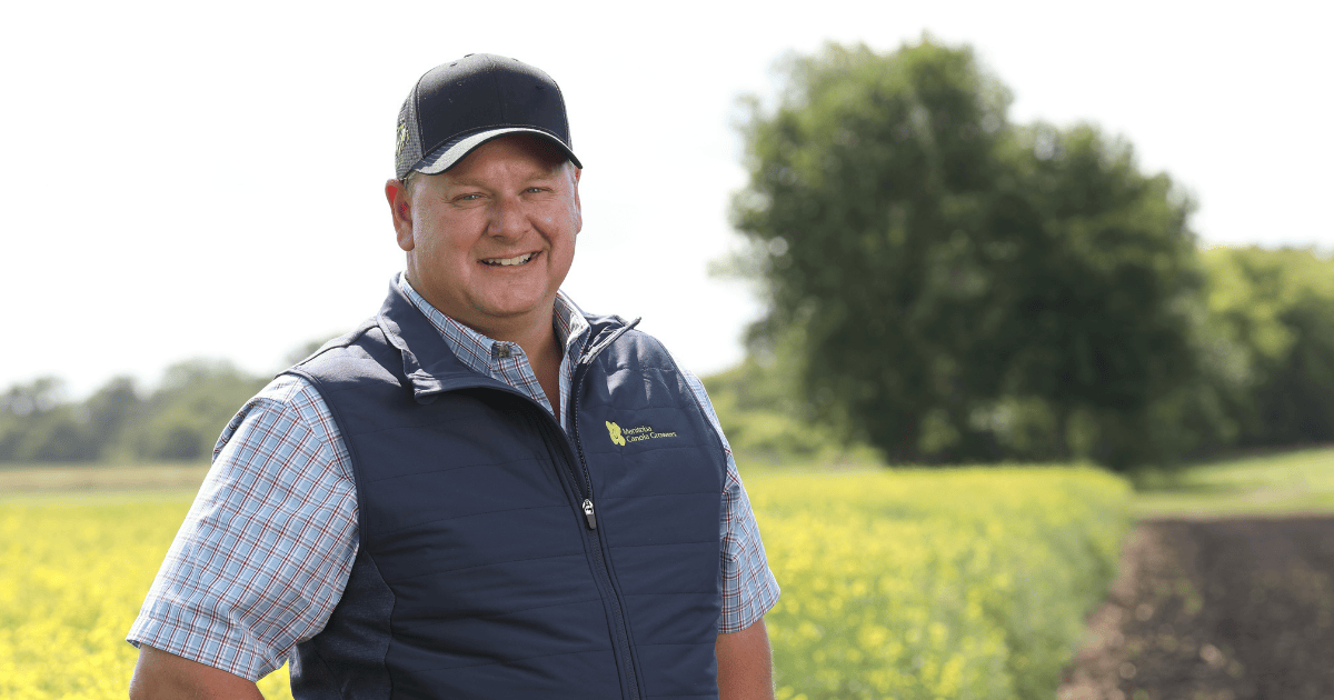
Over the past year, Manitoba Canola Growers has taken a close look at who we are, how we represent Manitoba canola farmers, and how we show up across the industry. The result is a refreshed brand that’s bold, classic, and built around a strong Manitoba identity.
You’ll notice more than a new logo.
We’re also bringing our digital presence together under @ManitobaCanola, including our social channels and website. It’s a simple change, but an important one. We want our name to clearly reflect who we’re here for and where our roots are firmly planted: Manitoba canola farmers.
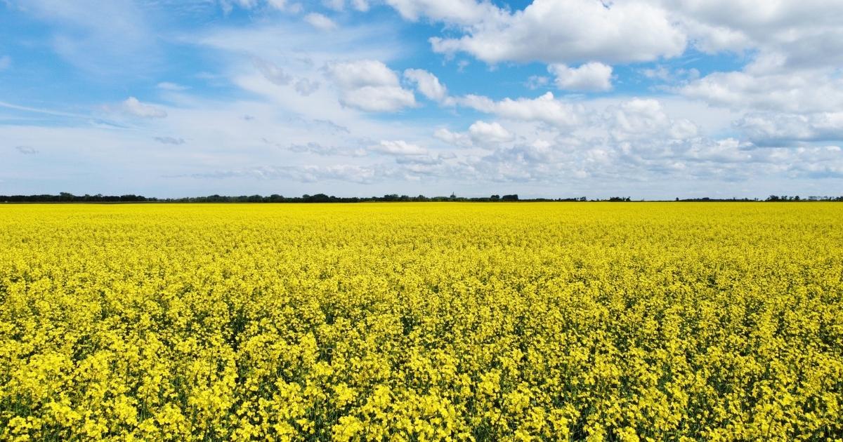
The new look leans into strong prairie colours, clean lines, and a logo designed to work everywhere from research reports and field signs to hoodies, social posts, and the side of a half-ton.
Getting here took plenty of exploration along the way. We tested different layouts, styles, and concepts before landing on a brand that felt strong, practical, and built to last, just like the farmers behind it.
While the look is changing, our focus is not.
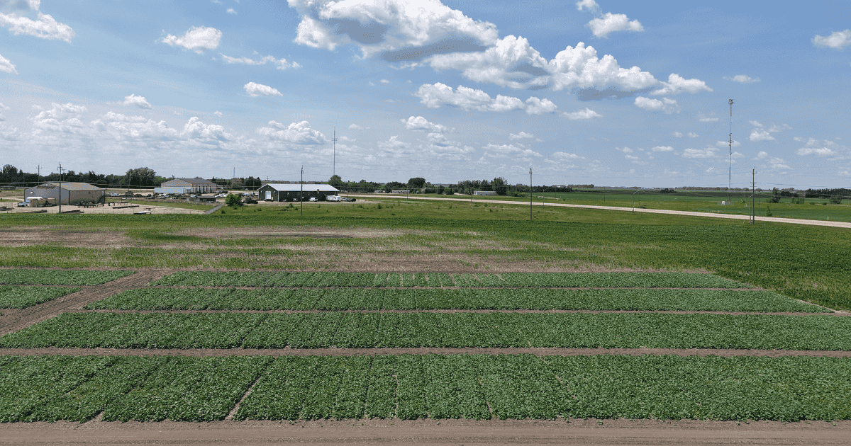
We remain committed to supporting Manitoba canola farmers through:
- research and agronomy
- canola demand
- and farmer-focused leadership
Same mission.
Fresh paint.